Sharpen the identity
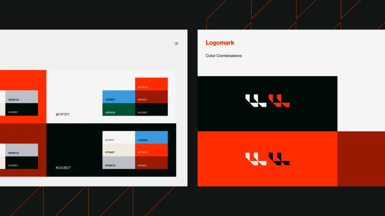
Introduced a disciplined black, white, and scarlet palette with a geometric visual language and a consistent global brand guide.
A Montreal supply-chain consultancy suddenly pitching against the world’s premier firms — a sharper global identity that made deep engineering expertise legible, credible, and easier to buy.

LIDD designs and implements supply chains — network strategy, distribution-centre design, and the systems that run them — for manufacturers, distributors and retailers. Expansion from Montreal across North America and into Asia put a practitioner firm into pitches against the world’s premier consultancies, where engagements are capital-intensive and shortlists are credibility contests. Its digital presence had not made that jump: the work was sophisticated, the presentation was not, and complex expertise was hard for new markets to read — or to shortlist.
Strategy-only firms advise; LIDD also engineers and implements. That practitioner credibility is the differentiator against much larger consultancies — so the brand had to feel as exact as the work, while making a sprawling offer simple enough for a senior buyer to grasp in one pass.
Introduced a disciplined black, white, and scarlet palette with a geometric visual language and a consistent global brand guide.
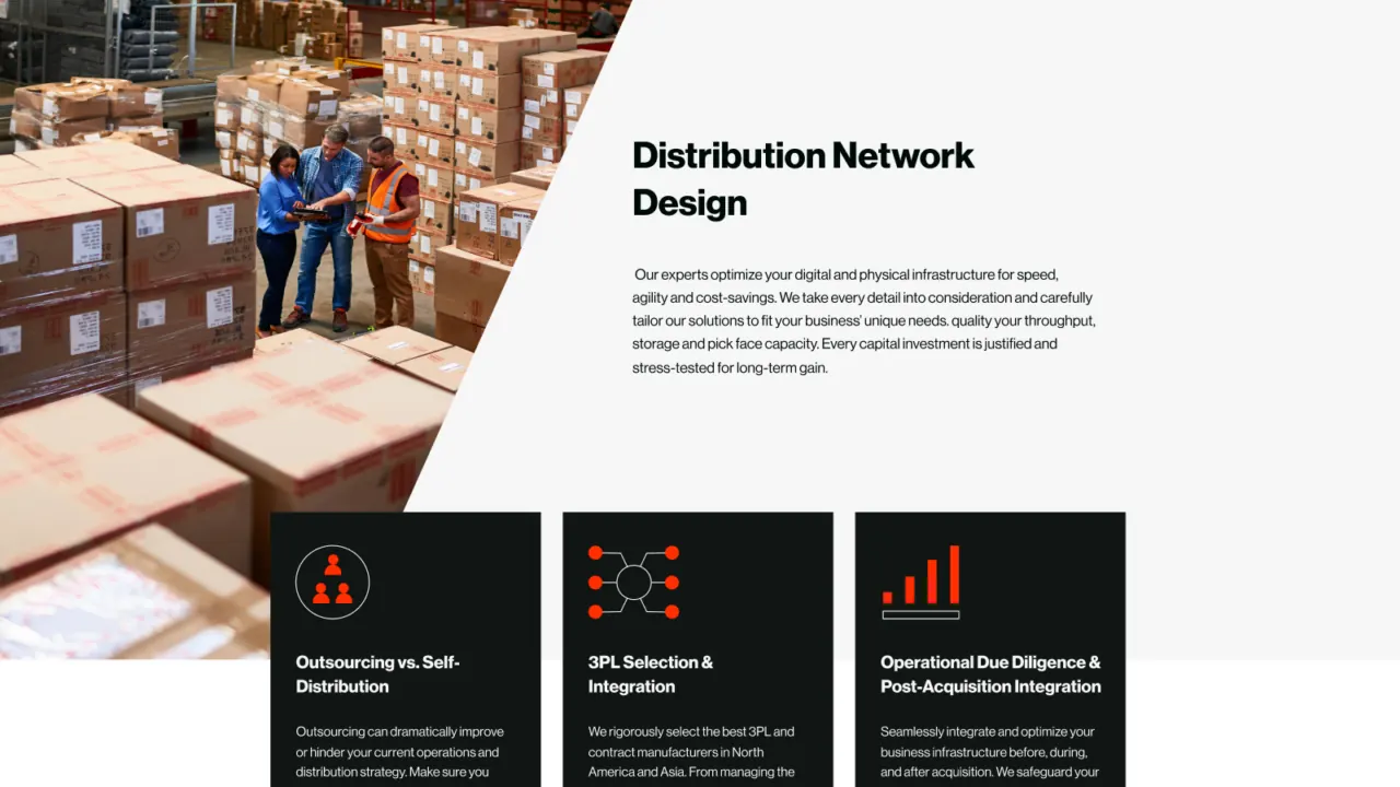
Consolidated services into four clear categories, so a complex portfolio reads as a short, buyable list.
Built a multilingual digital experience with streamlined navigation and stronger hierarchy, so the story lands the same way in every region the firm sells into.





Freddy was the Art Director and a contributing designer. The strategic framework was developed by Tiller; Freddy directed and helped execute the visual identity and digital expression with the credited team.